Mass Alerts
Similar competitor products were dominating. Our smaller team had to be creative to regain market share.

The first major change was to implement multilingual functionality. This was crucial for our international clients and larger colleges. Accounts can preconfigure preferred languages in their settings, and these chosen languages show as translation options when sending a mass notification.
Features Galore

There was debate on whether or not users should be able to edit the details of their message directly from the review screen. We settled on partial editing capabilities and also cleaned up the displayed data.
Review Time

As part of an educational webcast series for clients, we created walkthrough videos for each new feature created. This helped to ease people into the upcoming portal changes. I wrote, directed and edited these informational videos.
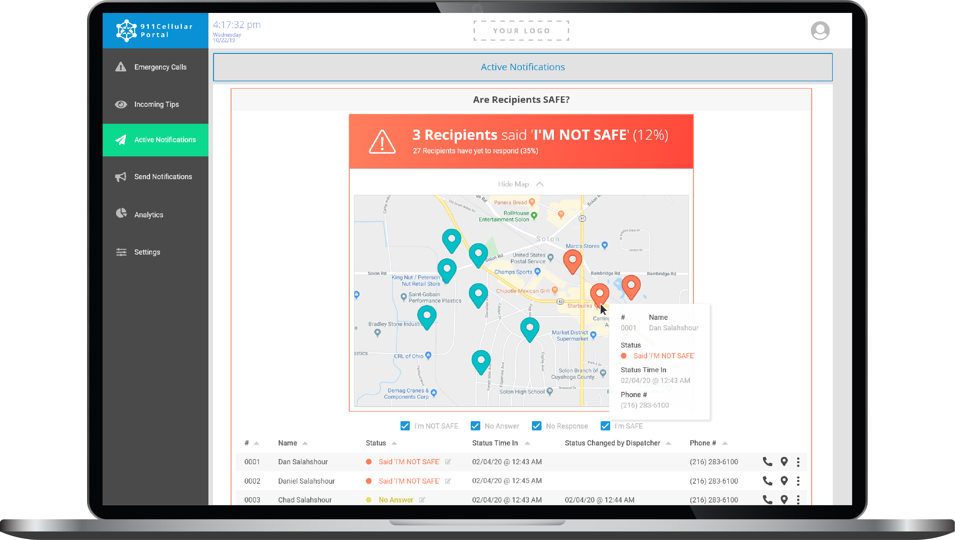
One of our most ambitious feature requests involved asking clients' community members (app end users) if they're safe. The request would be initiated by the mass alert user during a crisis (a mass shooter, a serious weather event, etc.). The end user can then respond with whether or not they're safe through a variety of platforms. Location tracking can also be activated to map out safe vs. unsafe end users.
Locating End Users
With brand recognition and first-mover advantage, our larger competitors were eating away at our mass alert product's customer base. It's an industry where trust is everything and risk-taking can be fatal, so thinking creatively is not usually a priority. In this case, we had no choice. We needed to implement a variety of customer-requested features but do so elegantly... and without creating a mess of our interface.
The Challenge
After redesigning this product, we competed against over 50 companies to acquire a statewide contract in Florida for our mass alerting technology. We ended up beating out every last one of them (including industry titans AT&T and Motorola)! Ease-of-use was a major factor in the evaluation process for this RFP.
Outcome
Ranked as the #1 emergency communication solution by the Florida Department of Education's panel of experts, surpassing both AT&T and Motorola in product design.

This may have been the most UI-intensive project I've carried out so far. The sheer number of UI elements on each screen had to be reduced and prioritized to maintain a clean user experience. The 'I'm Safe' feature was the most interesting to design because it's functionality was so innovative in the market. I'm proud of the work our team accomplished and the praise received from Florida's DoE.
Final Thoughts
This was a multi-stage process where several newer features were implemented. My role was to simplify accessibility of these features while considering user flow and interface elements. With so many text elements and clickable elements, my UI design skills were put to the test often. I also provided style instructions to my team of designers to assist in the execution.
My Role

Clients can now schedule their mass alerts too... but in lieu of adding more buttons, we opted for an arrow to imply more sending options. The organization of the scheduled alerts became a priority as it now competes for space with saved templates.


The portal's interface displays plenty of data after a mass alert is sent, including a list of those app respondents who were asked if they're safe or not.

If any respondents say they're not safe, they'll automatically appear at the top of the list and can be contacted directly by dispatchers. Locations can also be displayed via dropdown map below the header.
Additionally, feedback options are tucked away beneath the message field and can be toggled to engage. An expandable survey can be filled out at this send screen as well, allowing the user to input their entire desired message all at once.
